Work 03

ステップラボ

Case Study

高度な分析データを「伝わる」形へ。医療・リハビリ現場をつなぐUXデザイン

Type of work
Platform
Client
view App Store >

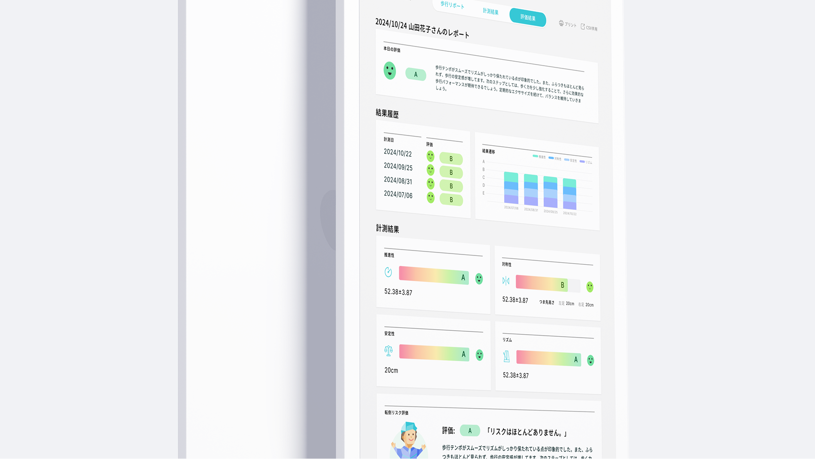
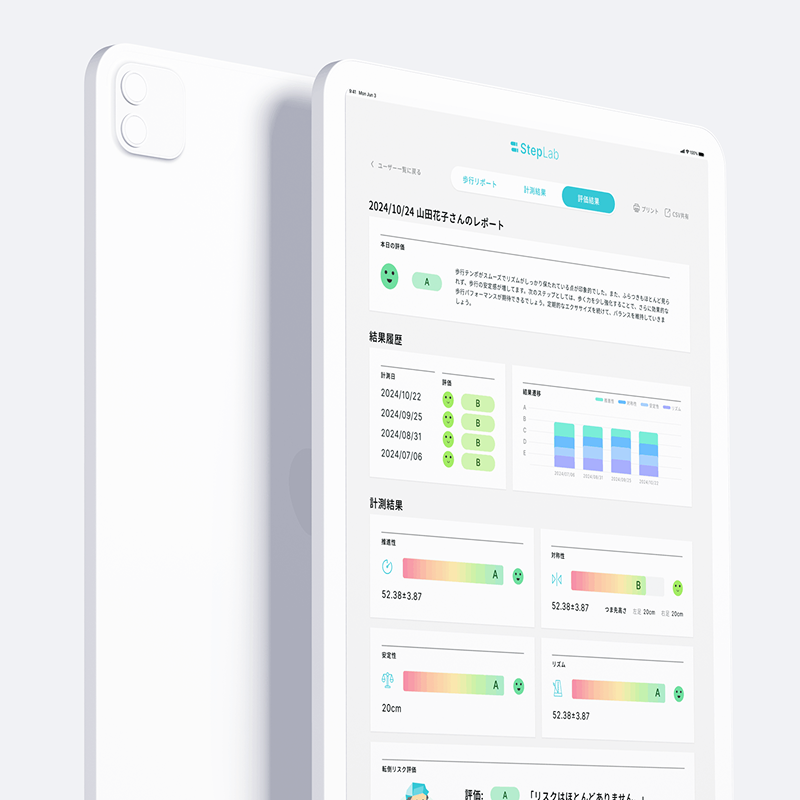
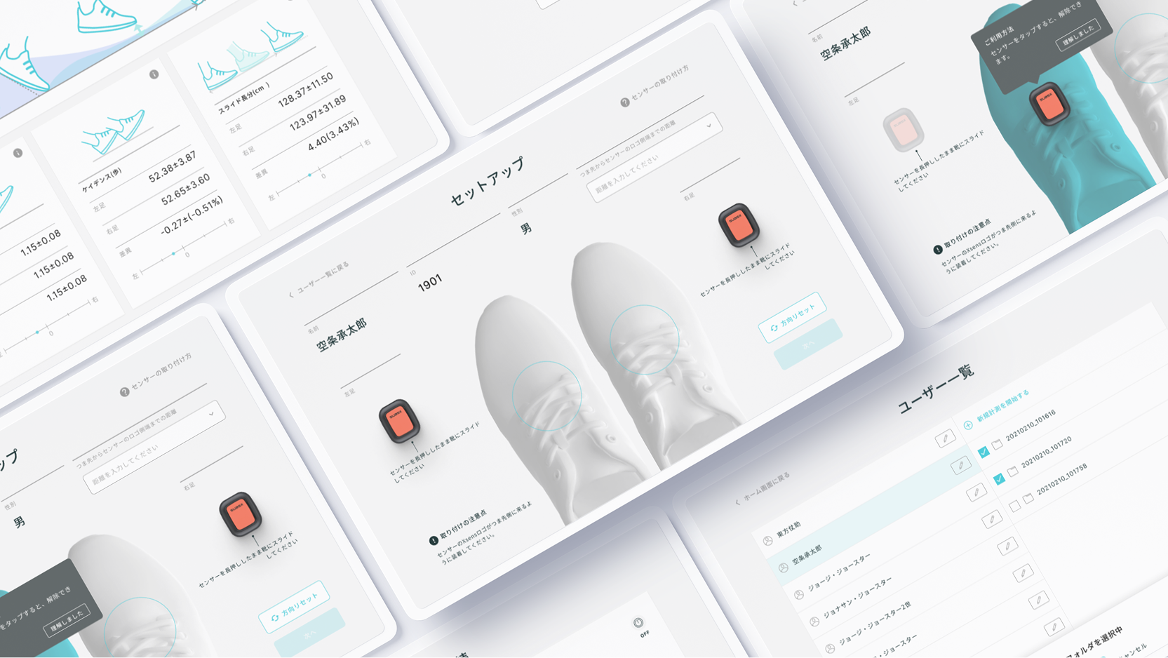
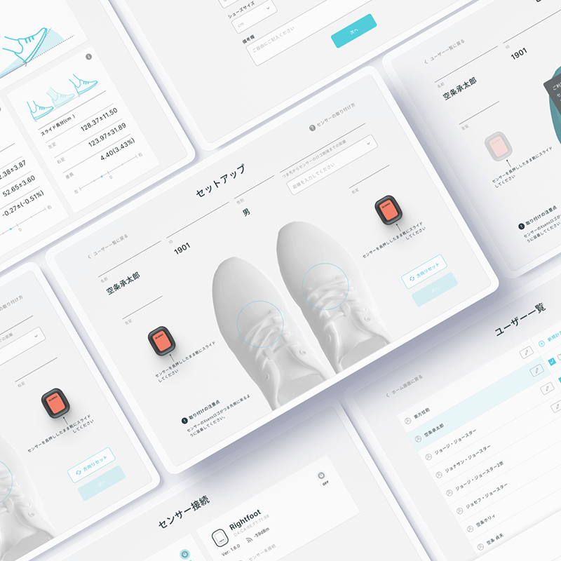
Supporting professionals with intuitive data visualization.
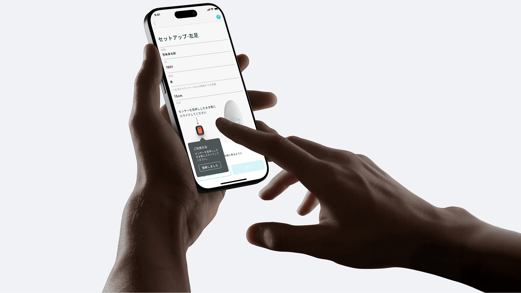
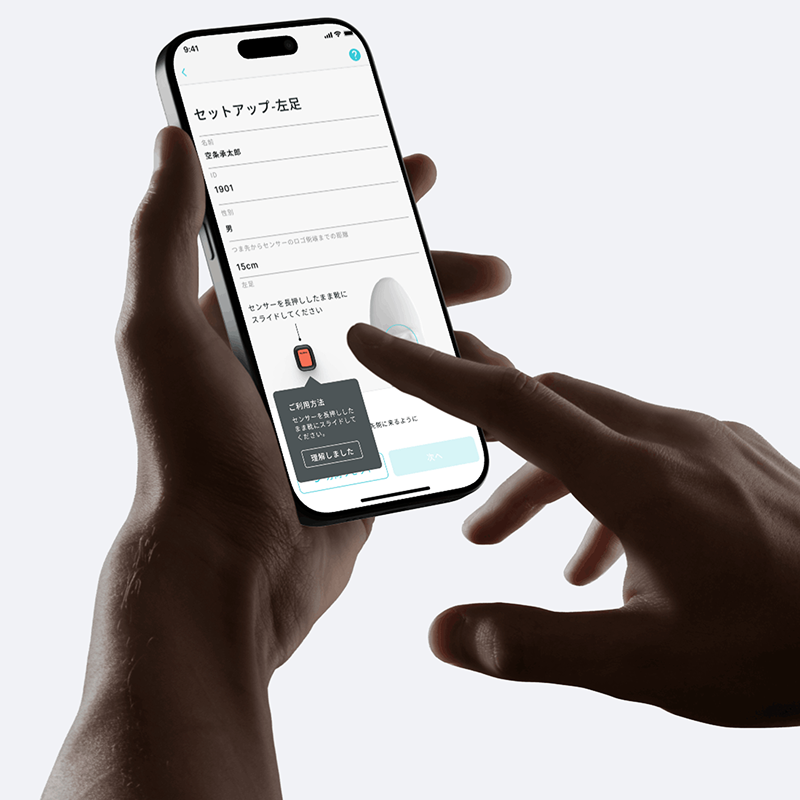
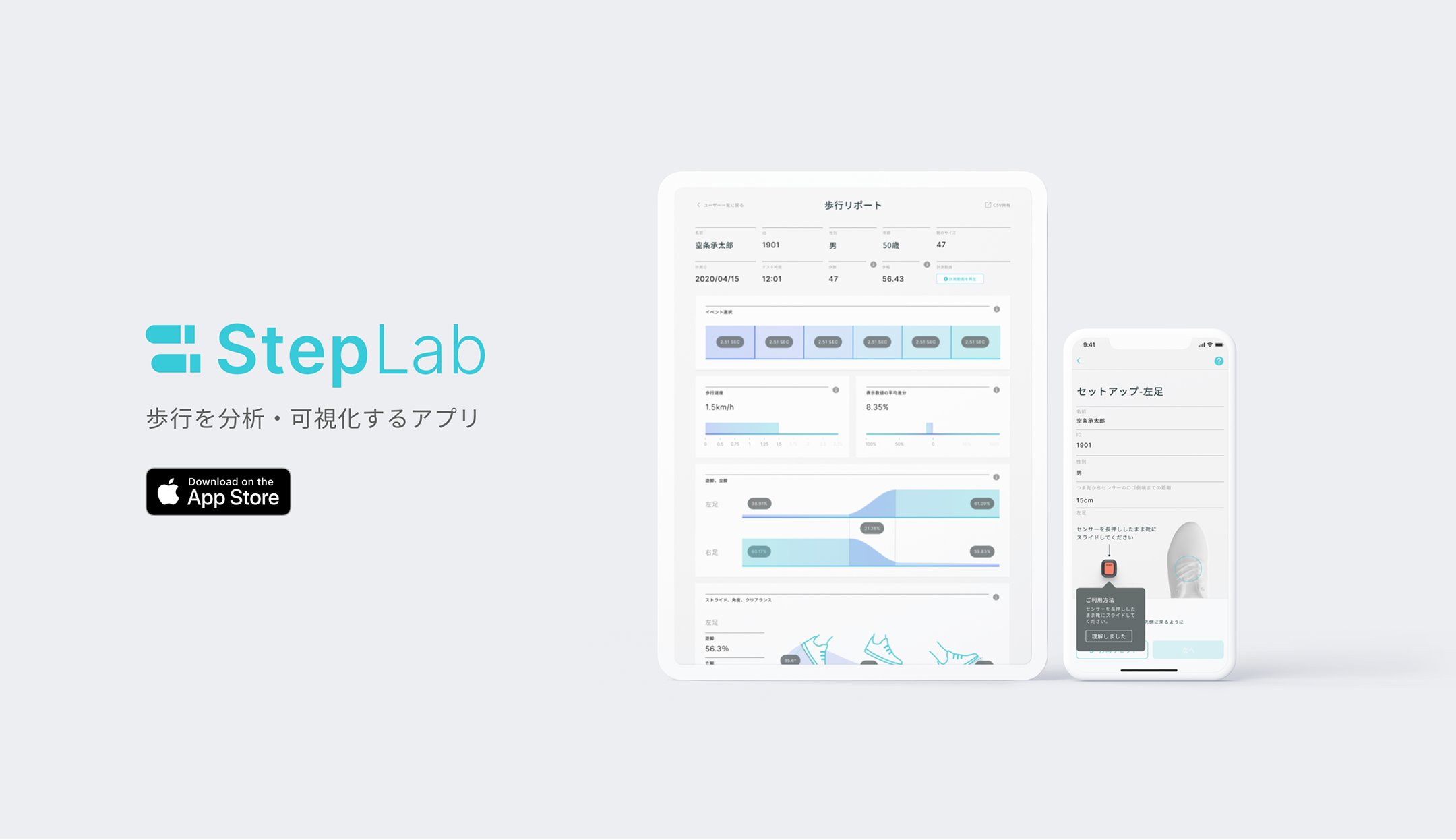
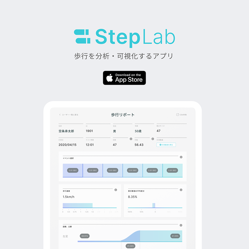
HELTEC Co., Ltd. provides "StepLab," a gait analysis tool for rehabilitation professionals using XSENS DOT sensors. We designed the UX/UI to help professionals explain complex biomechanical data to patients intuitively. The goal was to visualize "invisible" functional decline and facilitate communication between therapists and patients.

株式会社HELTECが提供する、医療・リハビリテーション従事者向けの歩行分析ツール「StepLab」のUX/UIデザインおよびブランディングを担当しました。本プロジェクトの核心は、センサーが計測する専門的なデータを、従事者が直感的に操作できるだけでなく、患者様(被験者)への指導時に「目で見て納得できる」形に可視化することにありました。

「隠れたリスク」の可視化とエビデンスに基づくデザイン

StepLab visualizes fall risks based on algorithms supervised by Juntendo University. We designed an interface that translates complex 86-paper-backed evidence into clear illustrations and a 5-grade scale. This allows professionals to point out risks that are hard to self-perceive, making their guidance more persuasive to patients and their families.

順天堂大学監修のアルゴリズムに基づく「転倒リスク評価」を、誰にでも分かりやすいUIへと落とし込みました。国内外86本の論文に基づく信頼性の高いデータを、専門家だけのものにせず、A〜Eの5段階評価や色分けされたゲージ、イラストで表現。自覚しにくい機能低下を「見える化」することで、被験者様やそのご家族が現状を直感的に理解できるようサポートします。

専門家と患者をつなぐ、共通言語としてのデザイン

While the app is operated by professionals, the screen is often viewed together with the patient. To bridge the knowledge gap, we incorporated 3D characters and friendly visuals rather than cold numerical lists. This "shared language" design fosters a positive atmosphere in rehabilitation sessions, encouraging patients to actively participate in their improvement.

このアプリは単なる計測機器ではなく、療法士と患者様をつなぐコミュニケーションツールです。画面を一緒に見ながら指導を行うシーンを想定し、冷たい数値の羅列ではなく、3Dキャラクターや親しみやすいビジュアルを採用しました。ポジティブなフィードバックや分かりやすい指標は、患者様のリハビリへの納得感と継続意欲(モチベーション)を引き出します。

In medical settings, clarity and ease of use are essential. We designed the interface to visually organize the complex flow—from sensor setup to report generation—ensuring that professionals can operate the app intuitively without extensive training. The clean, mobile-optimized layout reduces cognitive load, allowing therapists to navigate the system smoothly while keeping their focus on patient interaction.

専門的な機器設定や計測フローを、マニュアルなしでも直感的に操作できるUIへと落とし込みました。 センサーの接続からレポート確認に至るまでの導線を視覚的に整理し、次のアクションが明確に伝わるよう設計。モバイル端末に最適化されたレイアウトとクリアな画面構成により、操作における認知負荷を低減し、療法士がシステム操作に気を取られることなく、スムーズに業務を行える環境を提供しています。

結果

Average rating on the App Store

Achieved a high score of 4.8 out of 5 on the App Store following the release. Users praise the intuitive UI for simplifying complex medical data, noting that the "visualization of data" significantly aids rehabilitation guidance.

リリース後、App Storeで5点満点中4.8という高スコアを獲得。複雑な医療データを簡素化する直感的なUIや、リハビリ指導に役立つ「データの可視化」がユーザーから賞賛されています。

Download Insights

資料ダウンロード

We appreciate your interest in Delightment. You're welcome to download any resources you'd like to explore.

Delightmentにご興味をお持ちいただきありがとうございます。
気になる資料をぜひダウンロードしてご覧ください。

Download ダウンロード

Contact

お問い合わせ

Let’s talk, starting from where you are. Together, we’ll explore your ideas and shape them into thoughtful design.

まずは、気軽にご相談ください。あなたの想いや課題に寄り添い、丁寧なデザインでかたちにするお手伝いをいたします。

Let’s talk 相談してみる