Design with purpose
Design that resonates with what you stand for.
あなたの価値観に共鳴するデザインを。


あなたの価値観に共鳴するデザインを。
Supporting your business growth through branding and UX/UI design. We reflect your brand's essence in every touchpoint, creating a consistent and memorable online presence. Enhance user satisfaction and loyalty with us.
ブランディングとUX/UIデザインを通じてビジネスの成長をサポートします。ブランドの本質をすべてのタッチポイントに反映し、一貫性と記憶に残るオンラインプレゼンスを実現します。ユーザー満足度と顧客ロイヤルティを向上させます。
About 私たちについてを見るWe focus on UX/UI design for websites and digital products, supporting startups and companies in the areas of strategy and branding. We empathetically approach various business challenges from a human-centered perspective.
ウェブサイトとデジタル製品を対象としたUX/UIデザインを主軸として、ストラテジー、ブランディングの領域でスタートアップや企業をサポートしています。多様なビジネス課題を人間中心の観点から共感的にアプローチします。
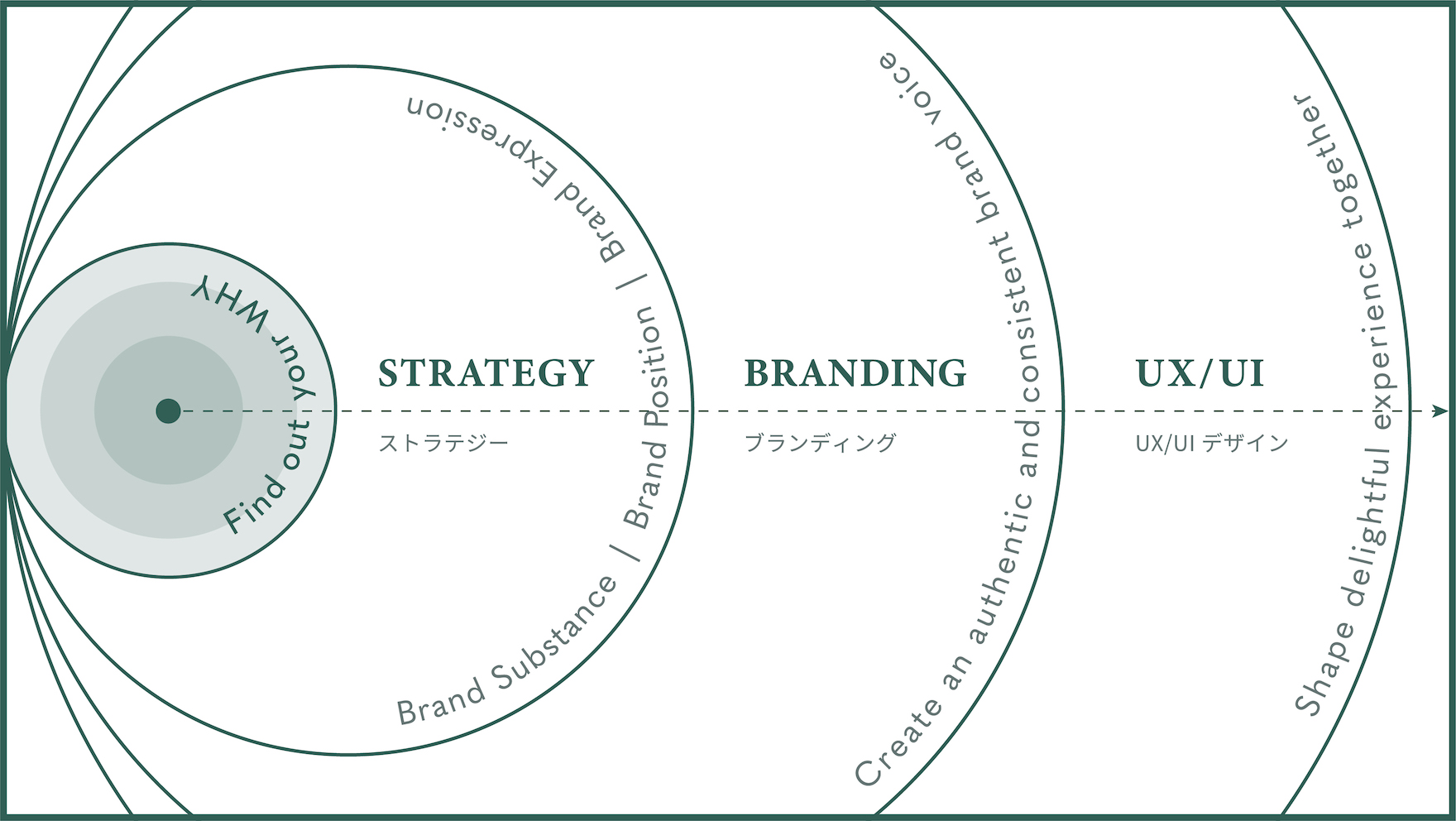
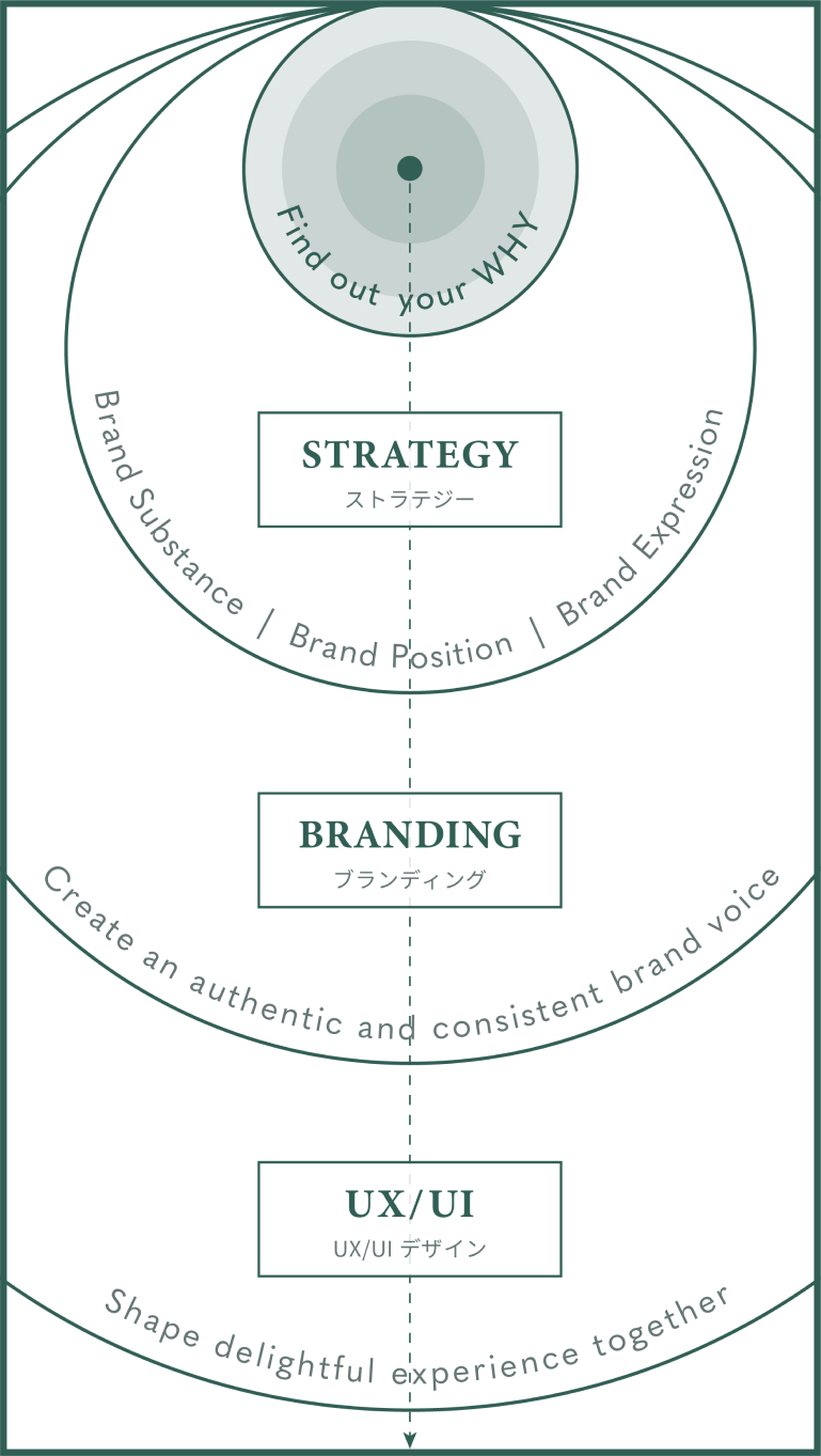
We structure complex challenges into clear, actionable steps.
Each project follows a shared mindset, with processes tailored to UX/UI design or branding depending on the scope.
複雑に見える課題も、整理すれば進む道は見えてきます。
共通の考え方をベースに、UX/UIデザインやブランディングの内容に合わせて、無理のないプロセスを組み立てています。

Bridging Professional Insight and Patient Understanding
高度な分析データを「伝わる」形へ。医療・リハビリ現場をつなぐUXデザイン
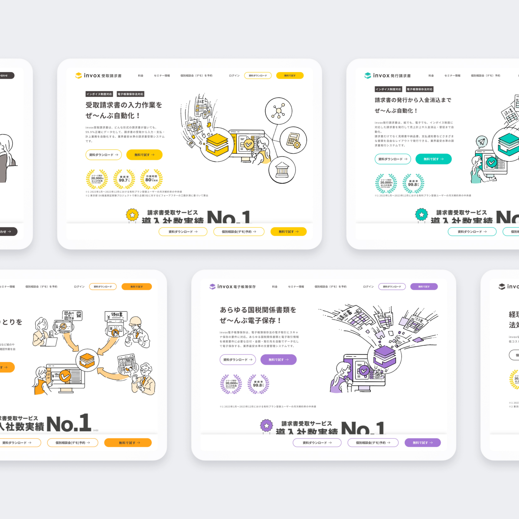
Strengthening Brand Power with Strategic UX/UI and Brand Design
戦略的なUX/UIとブランドデザインでブランド力を強化
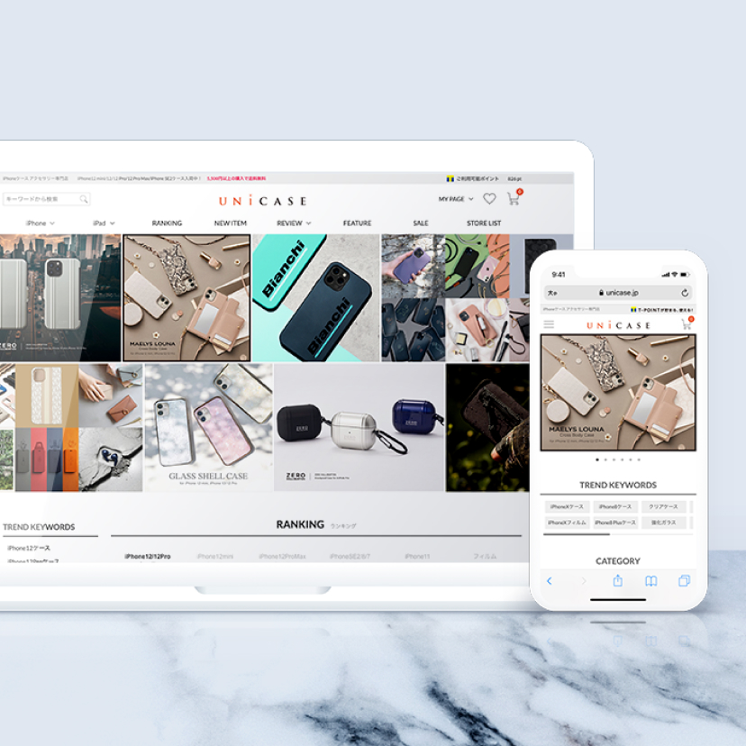
Simplifying a cluttered site for Millennials who prefer minimal and intuitive design.
情報過多のサイトからシンプルで美しいデザインを好むミレニアム世代に向けてのリニューアルデザイン
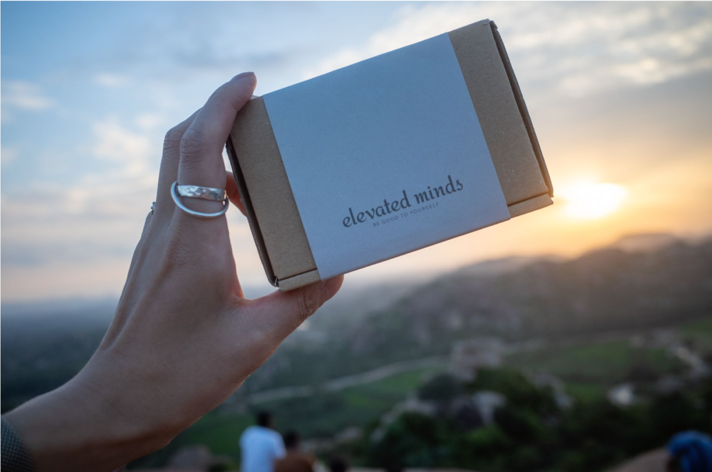
A wellness brand that started as an extension of UX design. While exploring ways to extend pleasant experiences beyond the digital realm to the physical realm, we were introduced to sage by a Native American graphic designer and discovered Palo Santo during a visit to Bali. This led to the creation of elevated minds, with the aim of bringing moments of relaxation to stressful daily lives and enriching people's lives. By offering high-quality self-care products made from natural materials, we are committed to supporting our customers' physical and mental well-being, and to achieving relaxation and stress relief.
UXデザインの延長でスタートしたウェルネスブランド。心地よい体験をデジタル領域のみならずフィジカル領域まで広げられないか模索していく中、ネイティブインディアンのグラフィックデザイナーより紹介されたセージと、バリに訪れた時に出会ったパロサントをきっかけに、ストレスフルな日常にリラクゼーションのひとときをもたらし、人生を豊かにすることを目指し、elevated mindsが誕生しました。自然素材を使用した高品質なセルフケア製品を提供することで、お客様の心身の健康と安らぎをサポートし、リラックスとストレス緩和を実現することを使命としています。
In this interview, we speak with Richard Cellis, a brand strategist, about the essence of branding and the role of dialogue in shaping strategy. His insights closely align with Delightment’s philosophy of uncovering identity and crafting brands that resonate with authenticity.
ブランドストラテジストのRichard Cellis氏を迎え、ブランドの本質や、問いと対話から生まれる戦略的アプローチについて語っていただきました。 Delightmentが大切にしている、「らしさ」を引き出すブランディングの考え方にも通じる、深く実践的な視点をお届けします。
Watch on Youtube Youtubeで視聴記事を読み込み中...

An overview of how we think and how we work,covering our UX/UI design and branding processes through real examples.
私たちの考え方や進め方を、UX/UIデザインとブランディングの実例を通してまとめた資料です。

You don’t need everything figured out.We’ll start by understanding your context and clarifying what matters.
課題が整理されていなくても大丈夫です。
まずは状況を伺い、考えるべきポイントを一緒に整理します。